
Case Study
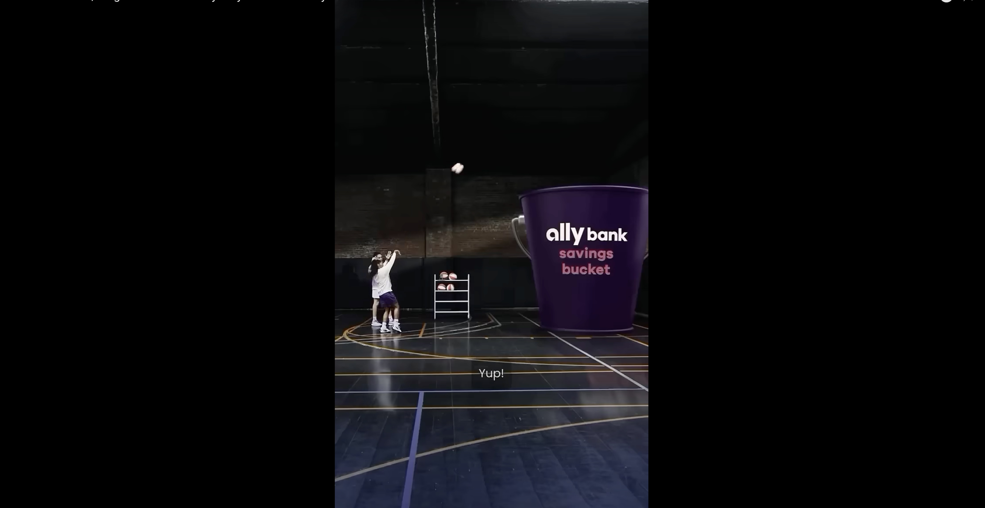
Spending Buckets: Digital envelope budgeting method
Role: UX Designer → Design Lead
Company: Ally BankDuration: Feb 2021 – Feb 2023
Team: Content Design Manager, Senior Web Designer, UX Mentor, Information Architect, UX Researcher
Platform: iOS, Android, Web
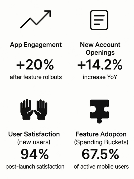
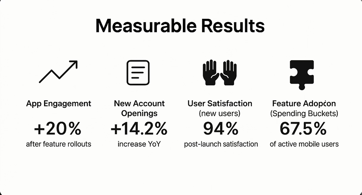
Impact: +20% app engagement, +14.2% new account openings, 94% new user satisfaction
🧩 Product Design
🔍 UX Research & Testing
🎯 Interaction Design
🎨 Visual Design
⚙️ Systems Thinking
🤝 Cross-functional Collaboration
🧭 Design Strategy & Direction
⚡ Rapid Prototyping
Inside the Work
🧭 Prelude: Setting the Stage
The world was shifting. People wanted clarity in chaos. Ally Bank had already given them a glimpse of order through "Savings Buckets"—a small revolution in how customers organized their money. But something deeper was stirring. Customers weren’t just saving—they were surviving. They needed a system to make sense of the mess—the bills, the subscriptions, the grocery trips that bleed the budget dry before goals even stand a chance.
Enter Spending Buckets. An idea born in the lab. Dormant. Half-formed. Full of potential.
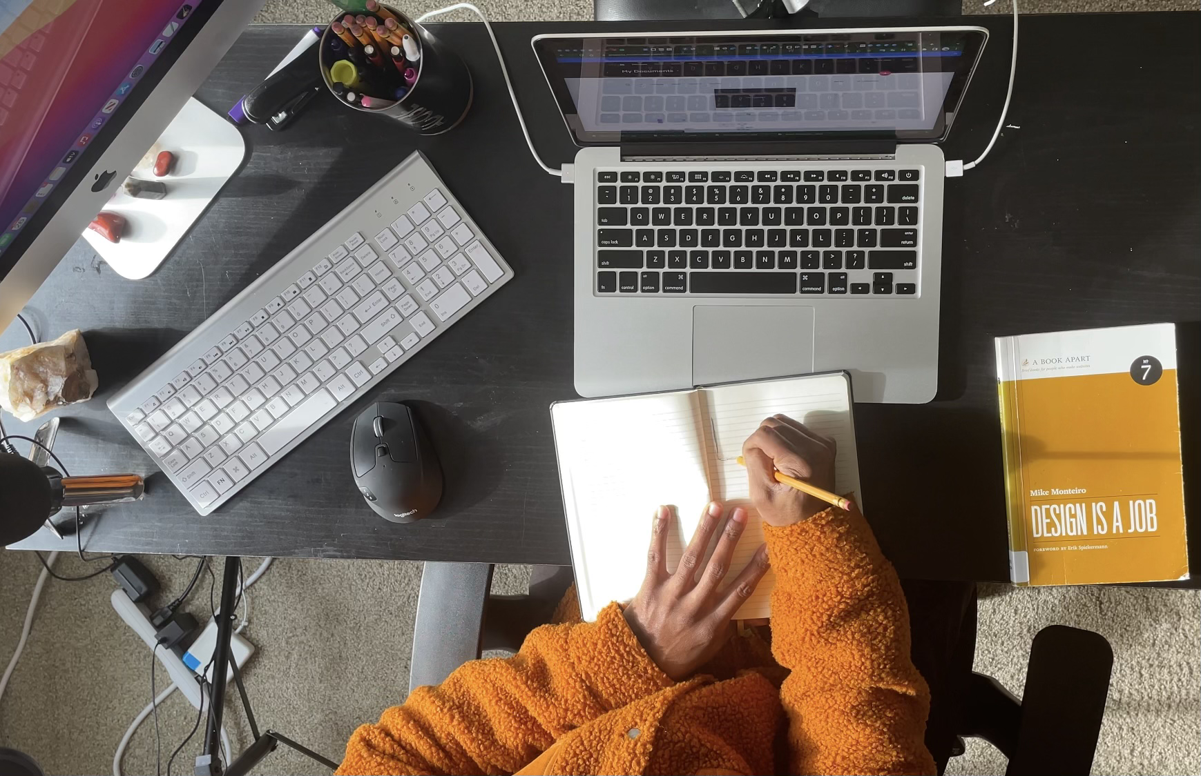
I entered this story during the height of the pandemic, working remotely out of Charlotte, NC. I was a junior UX designer—quiet but attentive, watchful. Over time, I would lead the vision—transforming this scrappy concept into a flagship feature that stitched together ambition, architecture, and empathy.
Uncovering User Pain
❗️The Problem
Most budgeting tools feel like control. This needed to feel like freedom.
We met users like Sam—a 30-year-old administrative assistant juggling bills and burnout. They weren’t looking for spreadsheets disguised as apps. They were seeking something human. A tool that spoke in visuals, guided with warmth, and didn't demand a finance degree to understand.
Behind every overdraft was shame. Behind every subscription was anxiety. The core question: Could we design a way to restore financial agency without sacrificing simplicity?
User-Centered Focus
👥 User Persona: Sam
- To guide our design, we built around Sam, a 30-year-old admin assistant earning $40K/year. She values simplicity, doesn’t have time for spreadsheets, and wants to feel more in control of her spending. Designing for Sam helped ground our decisions in empathy and real-world use.
Design Solutions
✍️ The Actions
We didn’t start with wireframes. We started with truth.
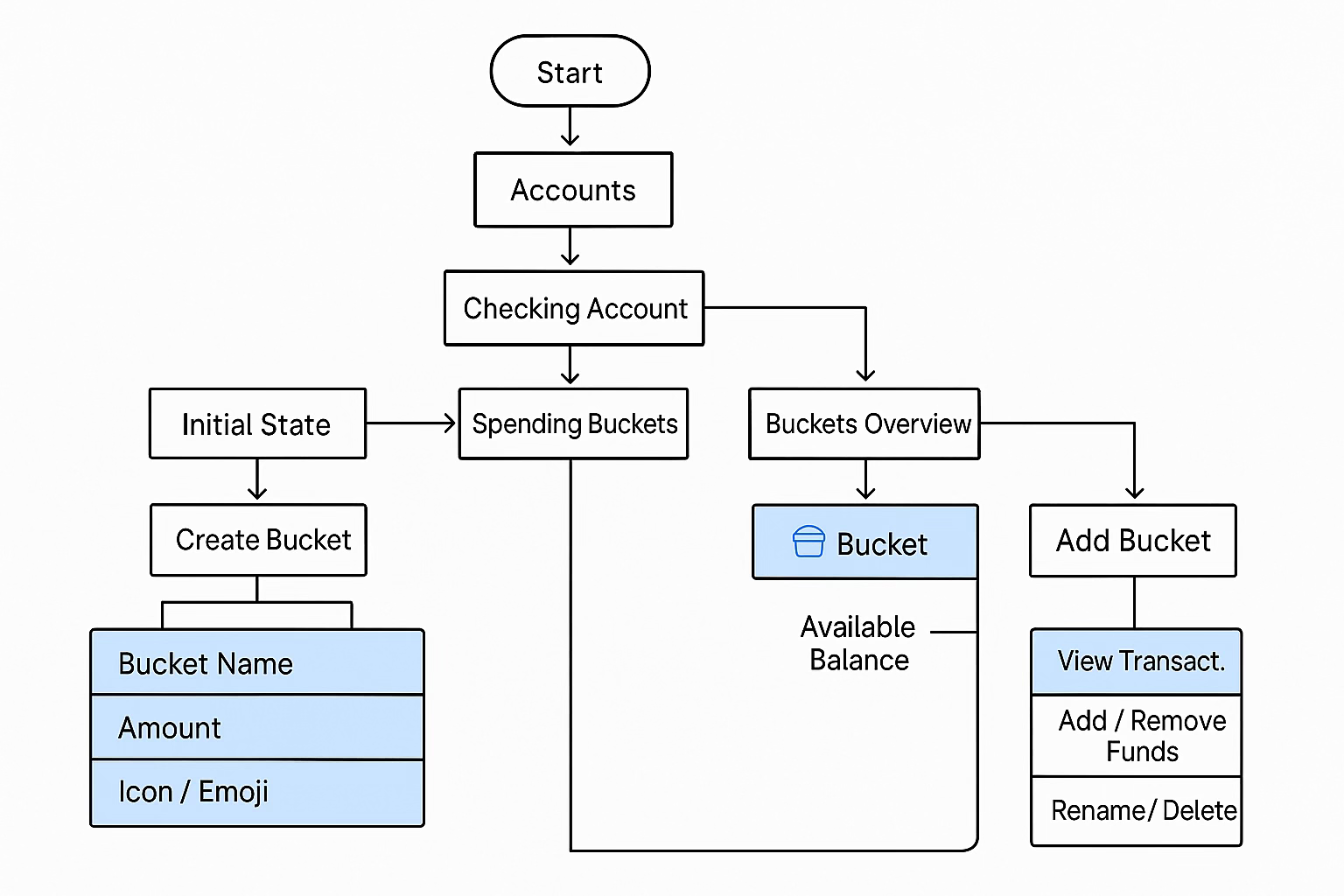
🧠 DiscoveryWe began with an Information Architecture workshop to trace the user's mental map. Then, we listened. Interviews. Competitive analysis. Pattern-seeking in pain points. People wanted one place to see everything. Customization. Clarity. Goals, not guilt.
✏️ IdeationWe pulled Spending Buckets out of Ally’s lab and gave it structure. I facilitated early prototyping and illustrated two design metaphors:
- A Linear Flow: like a tour guide through your spending.
- A Hub & Spoke: like a constellation—navigable, personal.
🧪 Testing & RefinementWe opened both to user testing. People loved the linear flow’s warmth—but needed more control. They wanted icons, colors, a sense of ownership. The Hub spoke to them—but got them lost.
We merged the strengths of both. Simplified the navigation. Added onboarding. Elevated the visuals. Created a category-first architecture that led with intention and minimized confusion.
🔧 ExecutionI led integration with Ally’s evolving design system, collaborating closely with content, engineering, and accessibility. Every word, icon, and transition was refined with care. It wasn’t just about design—it was about building trust.
Design That Delivered
✅ The Results
- We transformed a fledgling idea into a product that empowered users to reclaim control. Financial wellness, once elusive, was now something they could touch—bucket by bucket.
Eyebrow text to label this content
🧠 Reflection & Senior Impact
What Worked:
- Storytelling through design clarified the complex.
- Iterative testing refined the feature's soul.
- Collaborating cross-functionally gave the product durability and depth.
If I Could Rewind Time:
- I’d involve key stakeholders earlier—build buy-in from day one.
- Expand testing windows for deeper feedback.
- Draw clearer lines between recurring bills and spending goals.
View demo
View Demo
Testimonials
Here’s what people are saying in the app store about Spending Buckets
Eyebrow text to label this content
🎉 Final Product
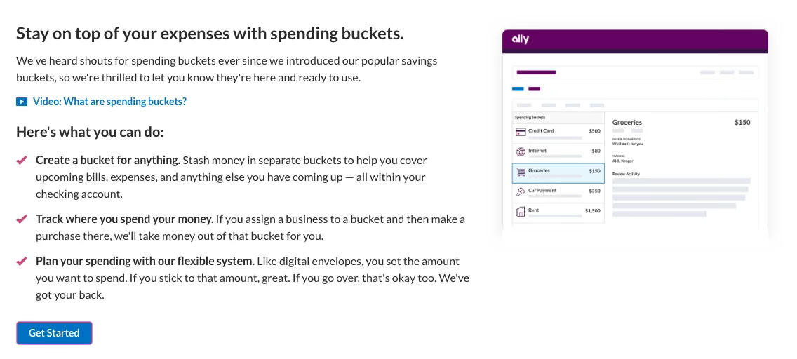
- The feature shipped on Ally Bank’s iOS and Android apps. While I cannot publicly link to the product, I can share visuals and prototypes upon request. Here's a sample of what shipped:
Eyebrow text to label this content
Where It’s Going
- We laid the foundation. Then came the whispers of what’s next:
- Smart auto-distribution
- Visual personalization
- Incentives for positive financial behavior
- AI-driven insights
- Richer accessibility across platforms
🔑 Key Takeaways
Spending Buckets wasn’t just a feature. It was a moment—a revelation. It asked me to lead, to listen, and to translate complexity into calm. What started as a side project became a statement of what design can be when it listens with heart and builds with intention.
It lives now in the hands of thousands. A quiet force. Empowering everyday choices. Beautiful in its purpose. Invisible in its grace.
- Simplicity wins trust in financial tools.
- A strong onboarding flow can drastically reduce user drop-off.
- Coordinated teamwork between design, content, and research can bring abstract concepts to life—even under shifting timelines.
✅ TL;DR – My Role
- Led UX for 4 core mobile banking features.
- Translated user needs into actionable design systems.
- Collaborated across Product, Engineering, Legal, and Marketing.
- Shipped features that materially improved customer engagement and satisfaction.

Other Projects

Connect with us to explore your project's potential.


OFFICE
San Francisco
CONTACT
contact@tyricehicks.com
SOCIAL
TYRICE HICKS
Case Study
Spending Buckets: Digital envelope budgeting method
Role: UX Designer → Design Lead
Company: Ally BankDuration: Feb 2021 – Feb 2023
Team: Content Design Manager, Senior Web Designer, UX Mentor, Information Architect, UX Researcher
Platform: iOS, Android, Web
Impact: +20% app engagement, +14.2% new account openings, 94% new user satisfaction
🧩 Product Design
🔍 UX Research & Testing
🎯 Interaction Design
🎨 Visual Design
⚙️ Systems Thinking
🤝 Cross-functional Collaboration
🧭 Design Strategy & Direction
⚡ Rapid Prototyping
Inside the Work
🧭 Prelude: Setting the Stage
The world was shifting. People wanted clarity in chaos. Ally Bank had already given them a glimpse of order through "Savings Buckets"—a small revolution in how customers organized their money. But something deeper was stirring. Customers weren’t just saving—they were surviving. They needed a system to make sense of the mess—the bills, the subscriptions, the grocery trips that bleed the budget dry before goals even stand a chance.
Enter Spending Buckets. An idea born in the lab. Dormant. Half-formed. Full of potential.
I entered this story during the height of the pandemic, working remotely out of Charlotte, NC. I was a junior UX designer—quiet but attentive, watchful. Over time, I would lead the vision—transforming this scrappy concept into a flagship feature that stitched together ambition, architecture, and empathy.
Uncovering User Pain
❗️The Problem
Most budgeting tools feel like control. This needed to feel like freedom.
We met users like Sam—a 30-year-old administrative assistant juggling bills and burnout. They weren’t looking for spreadsheets disguised as apps. They were seeking something human. A tool that spoke in visuals, guided with warmth, and didn't demand a finance degree to understand.
Behind every overdraft was shame. Behind every subscription was anxiety. The core question: Could we design a way to restore financial agency without sacrificing simplicity?
User-Centered Focus
👥 User Persona: Sam
- To guide our design, we built around Sam, a 30-year-old admin assistant earning $40K/year. She values simplicity, doesn’t have time for spreadsheets, and wants to feel more in control of her spending. Designing for Sam helped ground our decisions in empathy and real-world use.
Design Solutions
✍️ The Actions
We didn’t start with wireframes. We started with truth.
🧠 DiscoveryWe began with an Information Architecture workshop to trace the user's mental map. Then, we listened. Interviews. Competitive analysis. Pattern-seeking in pain points. People wanted one place to see everything. Customization. Clarity. Goals, not guilt.
✏️ IdeationWe pulled Spending Buckets out of Ally’s lab and gave it structure. I facilitated early prototyping and illustrated two design metaphors:
- A Linear Flow: like a tour guide through your spending.
- A Hub & Spoke: like a constellation—navigable, personal.
🧪 Testing & RefinementWe opened both to user testing. People loved the linear flow’s warmth—but needed more control. They wanted icons, colors, a sense of ownership. The Hub spoke to them—but got them lost.
We merged the strengths of both. Simplified the navigation. Added onboarding. Elevated the visuals. Created a category-first architecture that led with intention and minimized confusion.
🔧 ExecutionI led integration with Ally’s evolving design system, collaborating closely with content, engineering, and accessibility. Every word, icon, and transition was refined with care. It wasn’t just about design—it was about building trust.
Design That Delivered
✅ The Results
- We transformed a fledgling idea into a product that empowered users to reclaim control. Financial wellness, once elusive, was now something they could touch—bucket by bucket.
Eyebrow text to label this content
🧠 Reflection & Senior Impact
What Worked:
- Storytelling through design clarified the complex.
- Iterative testing refined the feature's soul.
- Collaborating cross-functionally gave the product durability and depth.
If I Could Rewind Time:
- I’d involve key stakeholders earlier—build buy-in from day one.
- Expand testing windows for deeper feedback.
- Draw clearer lines between recurring bills and spending goals.
View demo
View Demo
Testimonials
Here’s what people are saying in the app store about Spending Buckets
Eyebrow text to label this content
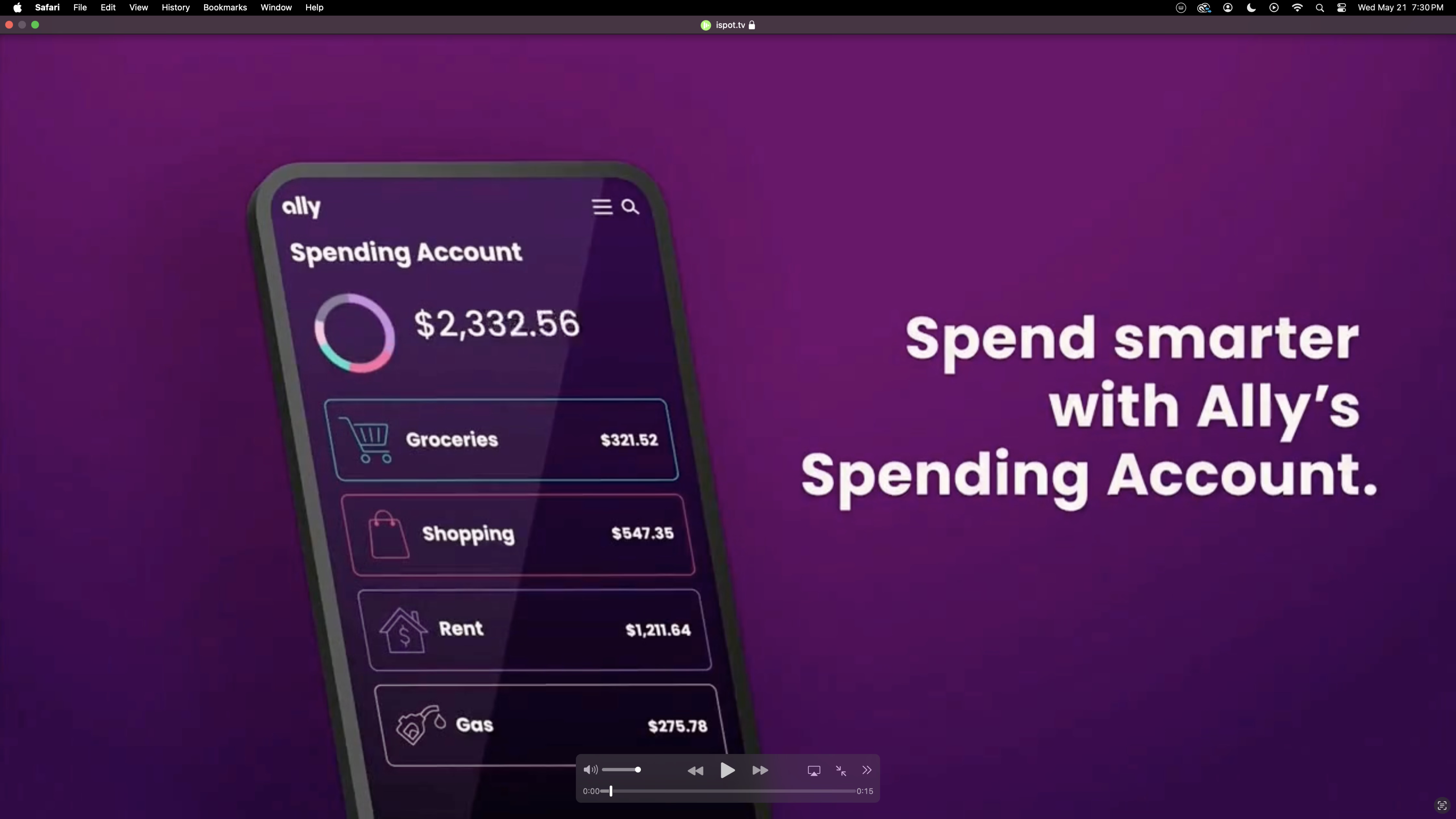
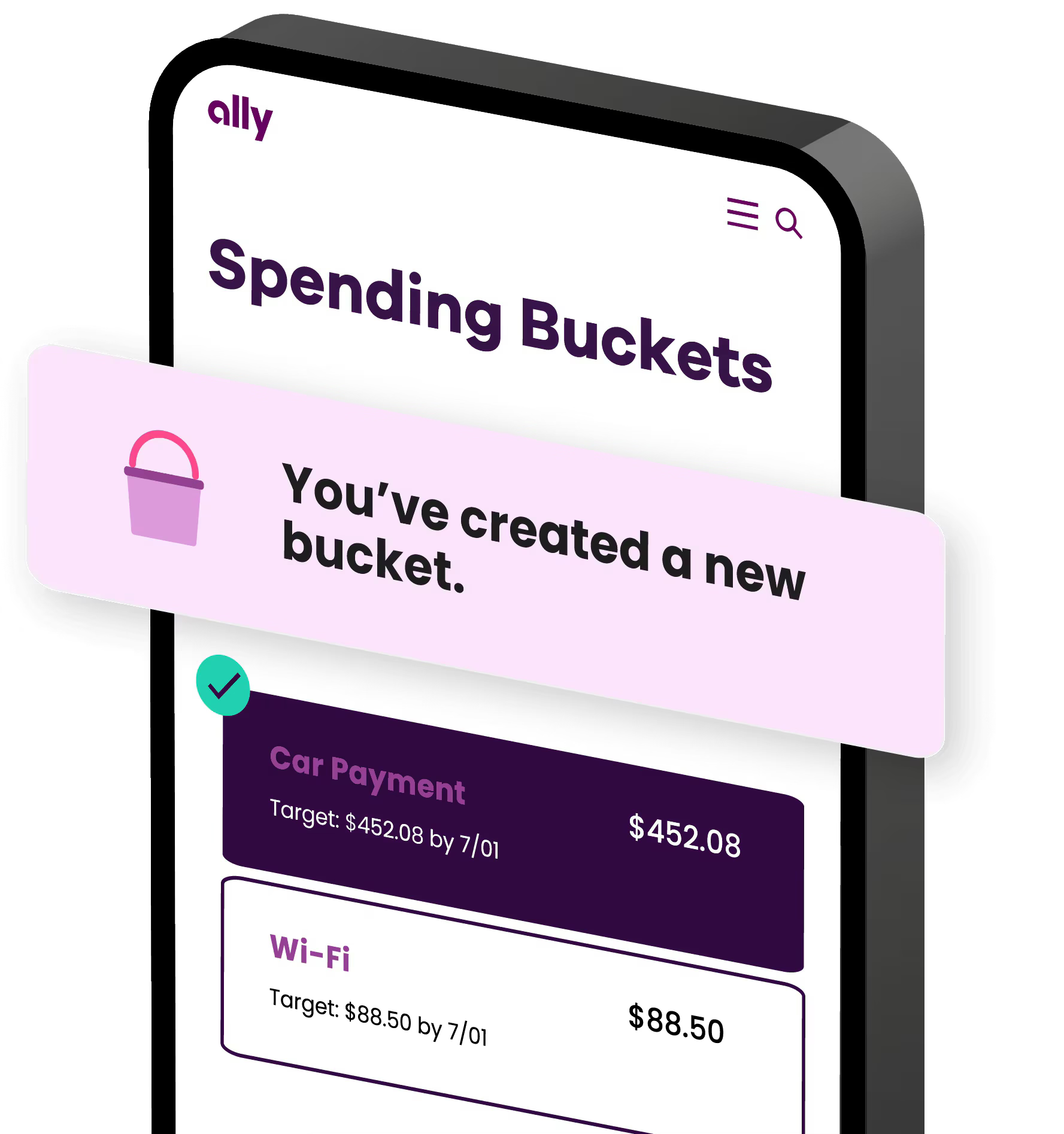
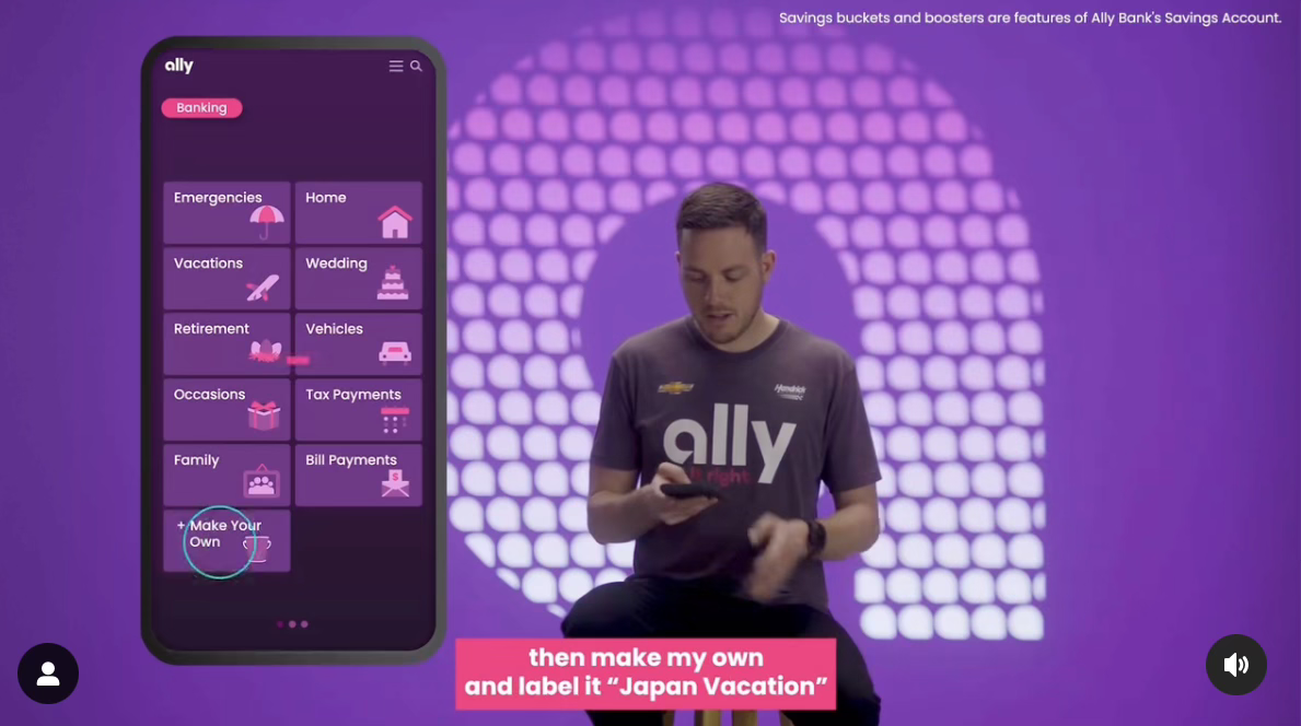
🎉 Final Product
- The feature shipped on Ally Bank’s iOS and Android apps. While I cannot publicly link to the product, I can share visuals and prototypes upon request. Here's a sample of what shipped:
Eyebrow text to label this content
Where It’s Going
- We laid the foundation. Then came the whispers of what’s next:
- Smart auto-distribution
- Visual personalization
- Incentives for positive financial behavior
- AI-driven insights
- Richer accessibility across platforms
🔑 Key Takeaways
Spending Buckets wasn’t just a feature. It was a moment—a revelation. It asked me to lead, to listen, and to translate complexity into calm. What started as a side project became a statement of what design can be when it listens with heart and builds with intention.
It lives now in the hands of thousands. A quiet force. Empowering everyday choices. Beautiful in its purpose. Invisible in its grace.
- Simplicity wins trust in financial tools.
- A strong onboarding flow can drastically reduce user drop-off.
- Coordinated teamwork between design, content, and research can bring abstract concepts to life—even under shifting timelines.
✅ TL;DR – My Role
- Led UX for 4 core mobile banking features.
- Translated user needs into actionable design systems.
- Collaborated across Product, Engineering, Legal, and Marketing.
- Shipped features that materially improved customer engagement and satisfaction.

Other Projects
HOME OFFICE
San Francisco
CONTACT
contact@tyricehicks.com
SOCIAL
TYRICE HICKS
Case Study
Spending Buckets: Digital envelope budgeting method
Role: UX Designer → Design Lead
Company: Ally BankDuration: Feb 2021 – Feb 2023
Team: Content Design Manager, Senior Web Designer, UX Mentor, Information Architect, UX Researcher
Platform: iOS, Android, Web
Impact: +20% app engagement, +14.2% new account openings, 94% new user satisfaction
🧩 Product Design
🔍 UX Research & Testing
🎯 Interaction Design
🎨 Visual Design
⚙️ Systems Thinking
🤝 Cross-functional Collaboration
🧭 Design Strategy & Direction
⚡ Rapid Prototyping
Inside the Work
🧭 Prelude: Setting the Stage
The world was shifting. People wanted clarity in chaos. Ally Bank had already given them a glimpse of order through "Savings Buckets"—a small revolution in how customers organized their money. But something deeper was stirring. Customers weren’t just saving—they were surviving. They needed a system to make sense of the mess—the bills, the subscriptions, the grocery trips that bleed the budget dry before goals even stand a chance.
Enter Spending Buckets. An idea born in the lab. Dormant. Half-formed. Full of potential.
I entered this story during the height of the pandemic, working remotely out of Charlotte, NC. I was a junior UX designer—quiet but attentive, watchful. Over time, I would lead the vision—transforming this scrappy concept into a flagship feature that stitched together ambition, architecture, and empathy.
Uncovering User Pain
❗️The Problem
Most budgeting tools feel like control. This needed to feel like freedom.
We met users like Sam—a 30-year-old administrative assistant juggling bills and burnout. They weren’t looking for spreadsheets disguised as apps. They were seeking something human. A tool that spoke in visuals, guided with warmth, and didn't demand a finance degree to understand.
Behind every overdraft was shame. Behind every subscription was anxiety. The core question: Could we design a way to restore financial agency without sacrificing simplicity?
User-Centered Focus
👥 User Persona: Sam
- To guide our design, we built around Sam, a 30-year-old admin assistant earning $40K/year. She values simplicity, doesn’t have time for spreadsheets, and wants to feel more in control of her spending. Designing for Sam helped ground our decisions in empathy and real-world use.
Design Solutions
✍️ The Actions
We didn’t start with wireframes. We started with truth.
🧠 DiscoveryWe began with an Information Architecture workshop to trace the user's mental map. Then, we listened. Interviews. Competitive analysis. Pattern-seeking in pain points. People wanted one place to see everything. Customization. Clarity. Goals, not guilt.
✏️ IdeationWe pulled Spending Buckets out of Ally’s lab and gave it structure. I facilitated early prototyping and illustrated two design metaphors:
- A Linear Flow: like a tour guide through your spending.
- A Hub & Spoke: like a constellation—navigable, personal.
🧪 Testing & RefinementWe opened both to user testing. People loved the linear flow’s warmth—but needed more control. They wanted icons, colors, a sense of ownership. The Hub spoke to them—but got them lost.
We merged the strengths of both. Simplified the navigation. Added onboarding. Elevated the visuals. Created a category-first architecture that led with intention and minimized confusion.
🔧 ExecutionI led integration with Ally’s evolving design system, collaborating closely with content, engineering, and accessibility. Every word, icon, and transition was refined with care. It wasn’t just about design—it was about building trust.
Design That Delivered
✅ The Results
- We transformed a fledgling idea into a product that empowered users to reclaim control. Financial wellness, once elusive, was now something they could touch—bucket by bucket.
Eyebrow text to label this content
🧠 Reflection & Senior Impact
What Worked:
- Storytelling through design clarified the complex.
- Iterative testing refined the feature's soul.
- Collaborating cross-functionally gave the product durability and depth.
If I Could Rewind Time:
- I’d involve key stakeholders earlier—build buy-in from day one.
- Expand testing windows for deeper feedback.
- Draw clearer lines between recurring bills and spending goals.
View demo
View Demo
Try Spending Buckets
Testimonials
Here’s what people are saying in the app store about Spending Buckets
Eyebrow text to label this content
🎉 Final Product
- The feature shipped on Ally Bank’s iOS and Android apps. While I cannot publicly link to the product, I can share visuals and prototypes upon request. Here's a sample of what shipped:
Eyebrow text to label this content
Where It’s Going
- We laid the foundation. Then came the whispers of what’s next:
- Smart auto-distribution
- Visual personalization
- Incentives for positive financial behavior
- AI-driven insights
- Richer accessibility across platforms
🔑 Key Takeaways
Spending Buckets wasn’t just a feature. It was a moment—a revelation. It asked me to lead, to listen, and to translate complexity into calm. What started as a side project became a statement of what design can be when it listens with heart and builds with intention.
It lives now in the hands of thousands. A quiet force. Empowering everyday choices. Beautiful in its purpose. Invisible in its grace.
- Simplicity wins trust in financial tools.
- A strong onboarding flow can drastically reduce user drop-off.
- Coordinated teamwork between design, content, and research can bring abstract concepts to life—even under shifting timelines.
✅ TL;DR – My Role
- Led UX for 4 core mobile banking features.
- Translated user needs into actionable design systems.
- Collaborated across Product, Engineering, Legal, and Marketing.
- Shipped features that materially improved customer engagement and satisfaction.

Other Projects

Connect with us to explore your project's potential.


Connect with me to explore your project's potential.

HOME OFFICE
San Francisco
CONTACT
contact@tyricehicks.com
SOCIAL
TYRICE HICKS